New Clays, Old Ways
I’ve been a super busy bee recently, but that’s no excuse for not making anything! Besides my “Day job” at a wonderful coffee house, I am also starting to run CLAYPLAY sessions at The Painting Pottery Cafe in Brighton! I demonstrate, teach and assist in Throwing and handbuilding techniques as well as guiding people through various ceramic projects they bring to the evening. check out the website for more info here; http://www.paintingpotterycafe.co.uk/clay-play/
I also had a show at the Candid Arts Trust space, in Islington, London, (The Islington Design and Craft Fair – IDCAF) where I was selling my work among other lovely crafts people. It was my first solo show since uni in terms of setting up and organising the stand as well as applying for the show itself. I had a great time and was quite happy with the look of the show, although I did pick up some tips for next time! Thanks to all who came to support me across the private view and weekend, it was great to see some familiar faces! And a super big Thank You to my parents for helping me to set up, pack down and for keeping me company and supplied with tea and biscuits! I also met a truly lovely couple who gave me some great advice and support over the weekend, who run an amazing knitted textile business (Check out JULES’ work here! http://www.juleshogan.com/ )


As I don’t have access to my own studio at present, I have been making a few simple pieces at my new flat. I’ve found it quite therapeutic to just sit and spend a little free time making some pinch pot vessels. They are also a great way to test out how the new clays I’ve recently acquired perform and if they can mix well together.


I’ve been experimenting with three different clays here; Vulcan Black Grogged Stoneware (A kind present from my good ceramic friend Souzana!), Scarva’s Special Porcelain and Potclays Premium Craft Crank. All of these clays fire to Stoneware temps (1170 – 1300) so I have also tried combining the vulcan black and the porcelain, and they are a little difficult to combine as they are polar opposites! I like the combination of textured black and smooth pure white especially when hand building. When throwing them (after light wedging) the black tended to hide most of the white, whereas there was more control when making the pinch pots. After sanding them off a little, the colour’s really stand out against each other! In the photo’s none of the pieces are fired yet but I had a little test of the two clays thrown together, and the vulcan black fires as dark as its name suggests, with a nice grogged texture, and the porcelain adds splashes of crisp white.


I’m quite keen to test out a nice glaze or two over these different clays, but perhaps only on the interior, to allow the textures to be enjoyed more. I really love the celadon and dark blue stoneware glazes I was using earlier this year, which would be interesting to test out and hopefully develop some new glazes too!
Pinch Pot Memory Vessels – Birmingham Festival Continued!
So better late than never! Here are the photo’s from the rest of the In;site Festival commission, of the memory vessels.

This part of the project was the performance/ participatory section, as I was teaching the public to make pinch pots, which would then be placed on different graves or spaces around the Cathedral, to act as tributes to those that lay there. I wanted to use these small bowls, as I like the idea that people will make them themselves for a loved one, leaving not an imprint of themselves, but also a vessel for others to put things in. Many cultures and religions lay objects onto graves, such as small stones, flowers and coins. This stems back from our ancestors burying their dead with their possessions, such as The Ancient Egyptians, and the Greeks who used to put coins onto the eyes or in the mouth of the deceased to pay the ferryman Charon to row them into the underworld.
As well as a place to leave items that were dear to the deceased, the vessels act as a small memorial on their own – or a place to hold memories of times with the loved one.


I had some really lovely pieces made on the day, and everyone liked the idea that they would be placed onto the graves and around the green space. I really liked the idea of them being washed away in the rain and left for the elements. Some cultures have jewellery and dreamcatchers, that they believe break when the wearer is ready to live without it – for example a bracelet that is used for protection will break when the wearer is deemed out of harm. I hoped that this would transfer into the mourner starting to learn to live with their grief once the bowl starts to erode, that everytime they visit the grave they will become a little stronger, and the vessel a little smaller.


I think they work really well visually, and they are subtle yet intriguing around the site. I like that it becomes a sort of treasure hunt, looking for more as you walk around the space; this also makes people see the grave anew, imaging who the person beneath it was, and to also know that people still care about them even when they are gone.

Channeling my inner Edmund De Waal…
Thank you to everyone who came and made a pinch pot on the day! I hope to make another series like this, in another graveyard perhaps, or even to make some grave goods or memory objects in the future!
In;Site Festival Commission; Complete!
I’ve been having a little trouble uploading images, so I have split this blog up, into two of the pieces I made for the project, and the other pieces will be in the next one. I had an amazing two days in Birmingham (again more blog posts to follow of what else I got up to on my trip!), a city I have never visited before, to take part in Craftspace’s IN:SITE Festival in Birmingham Cathedral!
After a quick briefing and being introduced to the staff and volunteers, I started rolling out slabs for the big “Homage to the Unknown” urn. I had found out that around “80,000 people were buried in the cathedral churchyard. It was closed to new burials in 1885 because of crowding and insanitary conditions, but new interments could still take place in existing vaults and brick-lined graves.” (https://birminghamcathedral.wordpress.com/page/3/) I wanted to find a way to celebrate all those unknown people; those that have no grave marker but were still wonderful, beautiful and interesting nonetheless. I rolled slabs of clay onto different parts of the cathedral grounds to add impressions of the place, to imbue them with the spirit of the Cathedrals humble, unknown tenants. Then I constructed them into the urn, with a nod to the architecture of the church and to traditional urn and coffin shapes to influence the form.


I did have a few problems with the slabs drying out much too fast – it was such a brilliantly sunny and hot day, that as I was constructing the piece, it started to crack and become too dry and fragile to join nicely. I was also using porcelain (Scarva Special Porcelain), which I have not used much for handbuilding and can dry out quite easily. Its a lovely clay which I enjoy working with; it is soft and pure looking, but can also be manipulated well and can take a lot of texture, which is what I was after. I managed to avoid disaster by making the two halves separately, and keeping them nice and damp in plastic bags for a while. Usually a piece this size would be made over a few days, and then once it was constructed as a whole, wrapped up and allowed to dry out slowly over a week or so, so I was pretty pleased with the outcome!
Placement of the finished pieces were an important aspect of the commission, and I chose to set this piece on the steps of one of the cathedral entrances. This was to elevate it to show the importance of the unknown people, and to place it in a more protected and sheltered area of the grounds.


I also made a tribute to Samuel Lines, but I decided that it was too hot to make the urn shape I intended, as the clay would dry out too fast and crack apart or be too soft to hold its form if I left it covered up. So I decided to make a flat memorial instead. I still used the impressions of artists instruments, and the words from his blue plaque to make a more contemporary and fun memorial.


The pieces are a little rougher and a bit unfinished to how I usually work, but I’m really pleased with what I captured in only one day. Ceramics is temperamental and takes time and so making pieces such as these in a day was quite a challenge! I really enjoyed engaging with the public about my work and encouraging people to also take part and make some small pieces themselves, but more about that part of the project in the next post!
I also want to say a BIG thank you to Craftspace for inviting me to make work for their festival, and to all the staff and amazing volunteers who supported me on the day, and in the lead up to the commission.
Sneak Peak; In;Site Festival Ideas
I have my first commission for Craftspace’s In;site festival in Birmingham in a few days! I have been working on some different ideas, all of which need to be able to be created in one day, outside in Birmingham Cathedral.
My proposal involved making Urns for historical local figures, and then another as a tribute to some of the unknown people of Birmingham, using the grounds and graves to roll clay onto to imbue the surface with texture and an essence of the people and place.
The historical person I found most interesting who has connections to the cathedral, is Samuel Lines; a painter, designer and art teacher who lived and worked in Birmingham from the late 1700’s, until his death in 1863. He was a founding member of the Royal Birmingham Society of Artists, and was also a wonderful Landscape painter.

These shapes are inspired by the architecture of the Cathedral itself – I liked the domes on the top of the tower, and wanted to incorporate this shape into Samuel’s urn, and for the unknown’s tribute, I wanted to reflect the beautiful strong lines and cubic shapes of the main building. As I will be slab building the Unknown’s Urn, I wanted the structure is be fairly simple to let the impressions on the clay speak for themselves.


These are some small models of what I hope to be making out in the graveyard. I am going to be working with Scarva Special porcelain, which is a lovely smooth white clay which will take impressions well, and is nice to handbuild as well as throw with.
I like the way that objects and different materials leave traces and imprints on the clay surface, and so for Samuel’s Urn, I am using artists materials as well as imagery from the Blue Plaque on his old place of residence to decorate the piece.


The artists materials leave wonderful marks and also remind me of the silhouettes of buildings and city skylines; of which Birmingham is one of the largest in the country. I also wanted to use familiar imagery – so that people can understand a fragment of the mans life, and bring him into a more contemporary focus – not as just a long dead painter!
I will be posting more about the project in a few days, after I have completed my day at the festival! Please come and say hello if you are around Birmingham Cathedral on Friday 11th September!
I am Stocked in Quince’s of Brighton!
I met lovely Anne who owns Quince, a beautiful florists and decorative arts shop in the Laines of Brighton at an Open House private view earlier this year. She came to see my degree show and I now have a selection of some of my small vessels and my porcelain brooches for sale in her shop! This is the first shop I have work in, and hopefully one of many more to come! I’m pleased how great they look with the small flower arrangements in; perfect for the mantle piece at home, as wedding table decorations or even as a small flower holder on a grave (versatility on all fronts!)
The shop is on Nile Street, and the website can be found at http://www.quincebrighton.com/


Memory Boxes and Disks
From my research, I have learnt that many people think that keeping objects from a loved one is useful in the process of grieving and remembrance. People like to keep little trinkets and objects; letters, key rings, jewellery and photographs. But what if these most valuable items were lost, or damaged?
These memory boxes are created using a selection of photographs and objects that have been left to the living to make a memory disk. The Memory Disk is then fired onto the lid of a ceramic box – preserving the ephemera forever.
The two examples are from personal relics left to me that belonged to my grandfather or associated with his death, which I have made my own memory box for.
The other is from a collection of items that were found left behind at a disused building, which have allowed me to make a second box, based on someone I am unfamiliar with.
The making of these two Memory Disks has allowed me to create a formula, so that I can reproduce these ideas, but with different people, objects and photographs. Connections between objects and their owners can be very strong and these connections allow us to continue to bond with and remember those who have left us.

To make the pieces, I start by making drawings and taking photographs of the persons objects and the things they have collected throughout their life. I use their photographs and then start to build up imagery using drawing and watercolour painting.


The images are fused together to make the memory disks. These are then sent away to be specially printed and made into decals, which are then fired onto the lids of the boxes. I am considering taking commissions, so please contact me if you would like to know more!
Today is also the private View of my Graduate show at Brighton University! The show is open to the public from Saturday 6th to Sunday 14th June. . Aside from Ceramics, there are also makers showing jewellery, design products, furniture, sculpture and much more! Other courses such as Fashion, Textiles, Illustration, Graphics, Sculpture and Fine Art will also be exhibiting across the Grand parade Campus. You can find my work in the Design and Craft Section (in room 150) on the first floor.
Upcoming Degree Show and The History of Blue
I have been so busy making recently, and there are only two days left of the degree show build! The Private view is on the 5th June, and then it opens to the public (For Free!) from the 6th till the 14th June. Here are some of the pieces that I will be exhibiting up in the Master of Design and Craft section, and a short piece about the History of Blue, and its use in my current work.
These are some of the Scatter Jars / Urns for partial remains.

Thrown porcelain with reduction glazes

Two porcelain reduction fired urns, and one Resist Raku finish over petra

Various clay bodies and sizes, from a photoshoot at POSH TOTTY’s Brighton Sydney Street store
Dual Urns
I have already documented these urns in a previous post, but now they have multiplied!

The finished Deep Barium Glazed piece!

Blue Stoneware vessel

Tin White Earthenware glaze, with Gold lustre
As well as using earthenware glazes, I have also been developing stoneware ones, such as the glossy blue one above, and using lustres to add luxurious detailing. I love experimenting with glazes, and one of my favourite glaze applications is spray glazing. I have been developing the spray technique even more this year by using different shades of blue combined together, as well as lustres and enamels to add layers of colour, pattern and texture.


I have been researching into the colour BLUE extensively for this project, and have written a short piece about the history of the colour and why I am using it in my work.
A BRIEF HISTORY OF BLUE
Blue is a colour that has evolved to mean many diverse things, to different cultures and people. It’s meaning and symbolic purpose has changed many times, elevating it to more than a colour to paint a living room wall in.
Blue is not an “Earth colour”, in that it does not naturally occur, or cannot be found and used without man’s intervention. Only when humans began mining could they use it. The first blue was created in this way in Afghanistan around 6000 years ago when the Ancient Egyptians began mining Lapis Lazuli. It was highly prized and was combined with gold to adorn the Pharaoh’s tombs and palaces, and is often linked with their ideas of heaven, and of rebirth.1 They also created an additional blue by heating limestone, sand and copper to form calcium copper silicate which became known as the royal turquoise pigment “Egyptian Blue”.
The Mesoamericans created another “Great Blue” of the Ancient civilisations; “Mayan Blue” which is thought to have been made by a mix of indigo plant extract, a clay mineral called Palygorskite, and resin from the Maya’s sacred incense Copal. They used this blue in ritual contexts; in offerings, as a by-product of making incense2 and in murals. The Blue-green colour was used by priests and was related to ideas around death. For this reason the sacrificed and the sacrifice stones were painted blue.3 These rituals were a way to communicate with the dead, show gratitude to the gods, and to ward of evil.
Blue remained rare and expensive until the dawn of the industrial age, possibly explaining its use and association to royalty and divinity. In his 303AD painting of the Scrovegni Chapel, Giotto used the expensive blue pigment made from Lapis Lazuli to adorn the ceiling. The ceiling is Giotto’s depiction of heaven, of paradise; a blue expanse festooned with golden stars and Jesus, Mary and other saintly figures gazing down to earth. “Blue is a veil that hides great mystery, it hides what lies beyond it, beyond the stars. This is the great mystery that God hints at, through the colour blue.”4
Christianity bestows this most sacred of colours onto one of its most famous religious icons; The Virgin Mary. She wears “a dark, wonderful and expensive blue, befitting the Queen of Heaven.”5 Later, “Mary Blue” became Navy Blue, a colour denoting trustworthiness and authority, often used by bankers and the police. The United Nations even chose a less severe, softer shade of Robin’s egg blue for their uniforms.
Artists have often used blue in their works as the ultimate colour of emotion and deep feelings; Van Gogh’s Starry Night, Gauguin’s Clovis Sleeping, Dali’s Burning Giraffe and Munch’s The Kiss. Most of these painters used blue as an expression of depression, angst and sometimes even existential crisis, but perhaps none to the extreme as to match the artist who had an entire period of his early career devoted to this idea. Pablo Picasso’s famous Blue Period is a testament to despair and redemption, to depression, and according to the great psycho analyst Carl Yung, even potential schizophrenia and mental breakdown. He painted these series of mostly portraits after the suicide of his best friend Casagemas, many of which the dead man appeared in. It is thought that Picasso used these works and the colour blue as a catharsis, painting the depression and sadness out of his life. Another artist that uses blue, almost as the sole colour and ethos of his work is Yves Klein. He invented his own blue, “International Klein Blue” as a symbol of escape – from conformity, social pressures and capitalism. He was obsessed by it; the colour of the sea and sky; of infinity. It is all around us, but always just out of reach. He wanted a blue revolution, and called his blue masterpieces “Open Windows to Freedom”6
Blue has great complexity of symbolism and meaning; it has evolved greatly in different cultures. In American culture, “having the Blues” and “Feeling Blue” are symbols of depression, most notably connected with the musical style Rhythm and Blues (RnB); in Korea dark blue is the colour of mourning. However, in Mexico it is a colour that wards off evil and in India is used for protection and luck. In Hinduism Vishnu, the protector and preserver of the universe, is shown as having blue skin. The phrase “out of the blue” alludes to the great mysteries of life, or as coming from nowhere. To be awarded a blue ribbon is a high achievement.
Lastly during the 1960’s space race, the world saw its first images of what our world looked like – the Blue Planet. From this great celestial globe, hanging in a sea of black, illuminated by the stars, we saw blue for what it really was; the colour of home.
By investigating the colour blue, I have used these ideas and connotations to add layers of meaning to my own work. I am strongly drawn to the blue colour palette, as it shows a wide range of depth and emotion. By researching into what the colour blue means and its history as an evolving colour, I have used it to describe the journey of grief. Blue portrays grief, compassion, understanding, mourning and sadness but also a lightness and a warmth, it comes with royal and respectful connotations; sentiments that will help the grieving to grow and heal from their loss.
I enjoy the richness and the abundance of the colour, and the many shades and variations it comes in. I have used so many tones within my pieces to celebrate blue, and to allow each piece to mean something different to each person who perceives it – some will identify with the intense, vivid blues, that are thought to offer protection and ward of evil and others the quiet, more reflective lighter blue pieces that promote calmness. Everyone will experience death and mourning in numerous ways; so some will cope in a way that may seem distant or strange to our own. This collection aims to serve different notions of death and grieving, but to ultimately bring us all together in understanding and compassion.
References (Not an extensive list, but the ones that I have directly quoted from within this piece. A lot of sources and ideas are from my sketchbooks from this years projects)
1 http://www.ancientegyptonline.co.uk/colourblue.html
2 http://archaeology.about.com/od/artandartifacts/qt/maya_blue.htm
3 http://en.travesiasagradamaya.com.mx/mayan-symbolism.php
4 A History of Art in Three Colours; Blue BBC Documentary, Presented by Dr James Fox 2/8/2012
5 Blue Through the Centuries; Sacred and Sought After, Natalie Angier, , The New York Times 22/10/2012
6 A History of Art in Three Colours; Blue
Progress; Split Urns, Memory Boxes and Partial Remain Urns
I’m busy making and throwing lots, as there is only 4 making weeks left of this year! The time is going so quickly, especially since the workshops were closed for the Easter break, so here are some updates on what I’m working on right now;
Split Urns
These are urns designed for two people that are thrown from the same vessel and then split vertically and made into two pieces. The latest design I’m working on, is instead of the inside split being completely flat against each other, one will concave, and the other is eased outwards to mimic the curve, so that they fit together.This is a great new development, and the next stage is glazing them all! I have my first one out, and its an earthenware deep matte barium blue glaze, and I absolutely love it! I hope to have three more for the final show, so I still have one more to make!


The finished Deep Barium Glazed piece!

The latest Big Split urn, with detail around the neck
Memory Boxes and Memory Disks.
I am making memory boxes to be used to hold items of sentimental value that have been passed on from a loved one. I myself have many small objects that belonged to my Grandfather. I am making drawings and paintings using collections of these objects and old photographs, that I will make into decals and fire to the ceramic lids. I only have a few photographs of my Granddad and I, and by firing theses images onto the ceramic, they can be treasured forever. I wanted the piece to look watery and quite jumbled, as my memories of him are very old and quite faint now, so I mainly used watercolours and drawing pens.
Here’s the piece I have been making using my Grandfather as an example;


Some of the original drawings of the object

This is an unusually crafted piece, as I threw it as an enclosed form, then turned it upside down and cut the lid away from the now top of the pot. It was thrown in one piece, with the legs added on in the leatherhard state. It is fired to 1260 using the tin white glaze I developed in my second year (It is an earthenware glaze, but also looks lovely into the Stoneware ranges!) and a blue stoneware glaze on a petra grog body. This is the first proper lidded piece I have made in this way and I’m very pleased with the finish!
Partial Urns.
For these pieces I am using the same bottle forms and glazes, but in smaller sizes. I have also started to play around with some porcelain for the first time (a little risky in final year!). It is so clean and white and smooth and it is sometimes very trick to use! It can collapse very easily and is a very thirsty clay – which means it dries out and can become overworked very fast! A tutor of mine, Lousia Taylor (www.louisataylorceramics.com) who is an expert porcelain thrower, has been giving me tips – such as throwing with slurry to create a barrier between the clay and hands, so it doesn’t dry so fast, which has helped me a lot! I’ve also enjoyed throwing with terracotta clay too, as well as petra and modelling clay.


Quite a long post, so thank you for getting this far! Lots has been happening recently, and I have been making so many new discoveries and objects, but I will share some more photographs and the progression shortly!
I also handed in my 8000 word dissertation titled “What Were the Motives for Soldiers making Crafts During The First and Second World Wars” just before Easter, so that was keeping me pretty busy too!
Thank you to Alan Dell ( https://www.behance.net/alandellfe39 ) for the photo editing!
Home from Home – Ceramics at The V&A Museum
The Victoria and Albert Museum in London is probably one of my favourite museums in the world. It has so many objects and pieces of art and craft in it, its impossible to take it all in together. My favourite department is of course the ceramics rooms, which are full to bursting with exquisite pieces and also some lovely displays about how some pieces are made. I remember these collections first sparking my interest in ceramics when I was tiny, and then again which I was at college and even now I see new things whenever I go there.
I was also lucky to catch Matthew Raw in his residency space, who visited to give a lecture and tutorials at Brighton uni a few weeks ago. He showed me around and then we had a chat about my plans once I graduate, giving me some tips he found useful and some good places to apply for residencies. He showed me some of the things he’s been working on too, which look very exciting including running workshops and using objects from the museum collections as inspirations. Check out his website here; http://www.mraw.co.uk/home/pages/home.html and his pieces he’s written for the V&A website here; http://www.vam.ac.uk/blog/tag/matthew-raw. Thanks Matt!

This trip I was focussing on blues, whites and gold to influence the colours I’m using in my own work at the moment. Heres some pieces that caught my eye…

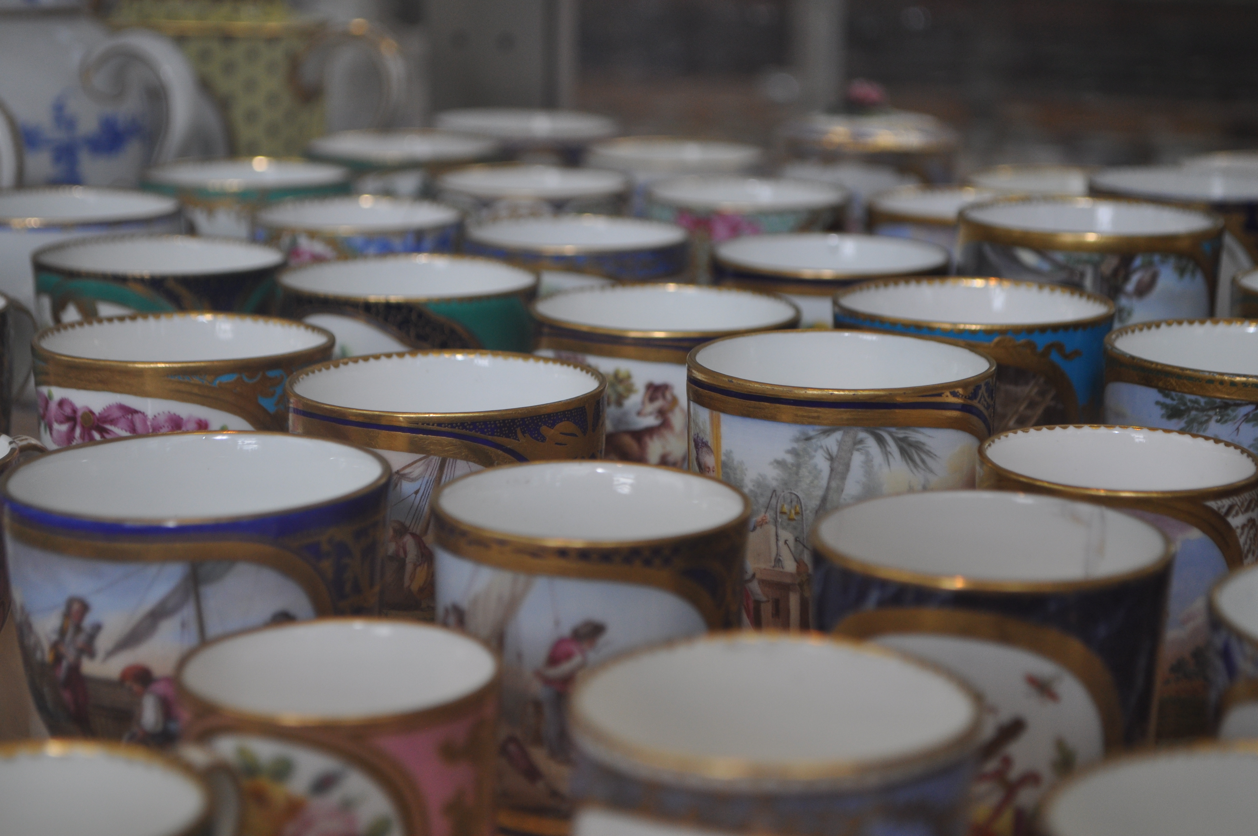
I loved these dainty French cups, so colourful and pretty. The gold and blue detail is lovely and gives such a feel of luxury and sophistication.

I’m also really into collections of objects – little tiny ones in particular! I often find myself drawn to grouping ceramics as I think they work well when they relate to each other and can be more powerful in bigger numbers. These are little Japanese bottles probably used for snuff. They are so detailed and carefully made!


I also fell in love with these two pieces, the left one is Chinese, from the reign of Yongzheng and is a special piece as it demonstrates an early two firings process – allowing ceramicists more colour range. The second firing allowed for the yellow enamel layer over the top of the painted cobalt decoration. I’ve never seen a pot like it before, and I almost mistook it for a modernized version of the traditional white and blue Chinese ceramic!
The right hand piece is Danish, with a blue crystalline glaze over porcelain with silver mounts, made by Royal Copenhagen.
The next few photo’s are from in the Blue and White Transfer printed ceramics display. There were lots of pieces I liked, one was this bucket (aptly named “Bucket”) by Phillip Eglin. I like the drawings and the references to the traditional willow transfer print pattern. The plate is one of my favourites from the display, I just really liked the dragon and the amount of detail that can be produced just from one colour palette.


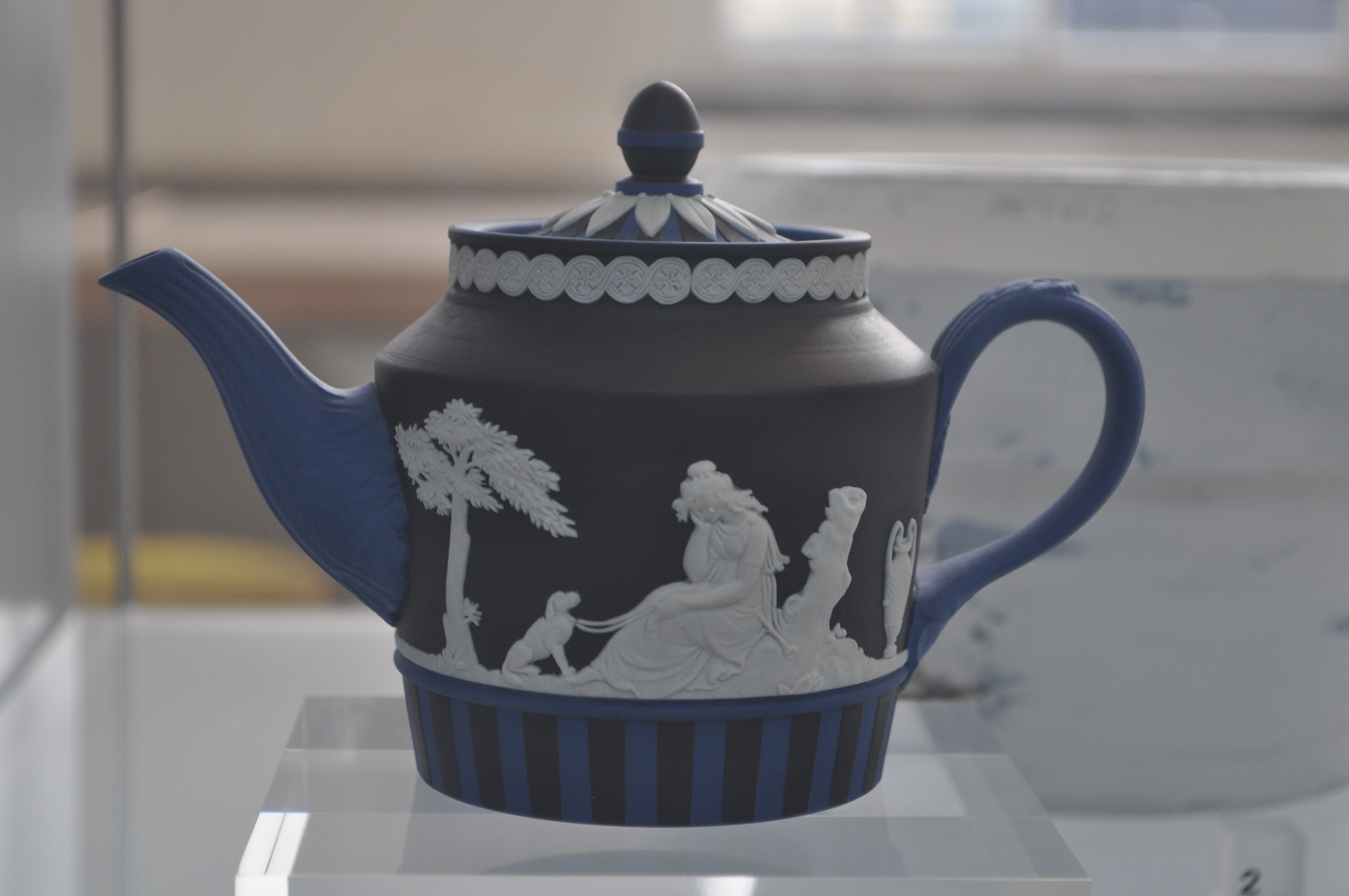
The last piece I found was a teapot, made in the iconic Jasperware style, but modernised by the addition of black to the typical blue and white, as well as the stripes. I’m not often a lover of teapots, but this one just captivated me.
After a lovely day in the V&A, I met my parents and we had a little wander around Knightsbridge, and had a mooch around Harrods. Its so beautiful and extravagant in there and my favourite rooms are obviously the food and chocolate ones! Its pretty expensive for most things (Well, for a student budget anyway!) but it was nice to look around a take some photos anyway!


Naked Raku! And Double Urns.
When I was on one of my placements in the autumn, I had my first go of Naked or resist Raku. Its a process whereby bisqued work has a slip and then a low fire glaze applied to the surface. Its then fired up to around 400-600 degrees in a raku kiln, or when the glaze begins to shine and melt (I don’t use cones, just keep an eye on what the glaze is doing!). Then it is taken out of the kiln and reduced in a sawdust atmosphere to achieve the mottled black and white surface; the clay goes black where there was no slip and glaze resist, and white with black mottling where the smoke crazes through the glaze, marking the clay body. I’ve used traditional raku techniques quite a bit before and its a process that I really love – its a fast firing and its so action packed and exciting; its about the only time you get to take really hot pieces straight from the kiln. These pieces are just tests at the moment but I’m going to have a few final pieces based on them I think!

Unfortunately one of the rims on one piece broke as it was quenched in the water, but I still really like the pattern on it. I also tried burnishing one of the pieces, but I think the white clay body looks duller when its fully burnished, without adding much more of a shine or smooth texture. I also tried terracotta and it came out really well! The unglazed/slipped part has gone a gray/black/silvery colour which looks really nice in contrast to the deep red of the body.


I’ve also been throwing some large urns in sections. I am happy with how they are going so far, but I’m still working on refining the form and turning them back better on the wheel before I slice them in half. This one is probably only just big enough for two (Small) people, but I’m working on another that is much bigger!


I also had a formative assessment last week, which meant trudging all my work to another uni building up a million flights of stairs! But it was good to get out all of the work for this project so far and reflect on what I have made, what I need to do next, and how I can improve. Here’s the work so far, all of which is in the testing and experimental phase, but lots to go and work from! In the photo is a little sneak peak of some stackable pet urns I’m working on too!
![20150219_140558[1]](https://lovealemon.files.wordpress.com/2015/02/20150219_1405581.jpg)
